[meta] Lists
The way lists look like or behave across the app is very disparate.
Issues
There are problems with buttons:
- buttons have totally different looks, even on their normal state
- actions offered are not consistent from one page to another
- sometimes we offer two dropdowns next too each other (play, play dropdown, more), and no way to know which one to activate
- we have redundant options (offering 3 times the possibility to "report" an item in a single dropdown doesn't look reasonnable)
There are different layouts, and this comes with issues:
- one vertical layout is used for artist (non channel page), playlists
- one two-panes layout is used for albums, artist channels, podcast channels
- thus layout is not enough to convey what we are looking at. Is it an album? A playlist? A podcast?
- the two-pane layout isn't adaptive and leaves a blank space on wider screens
Screenshots
Artist page (non channel):
Artist channel:
Album page:
Playlist:
Podcast channel:
Queue:
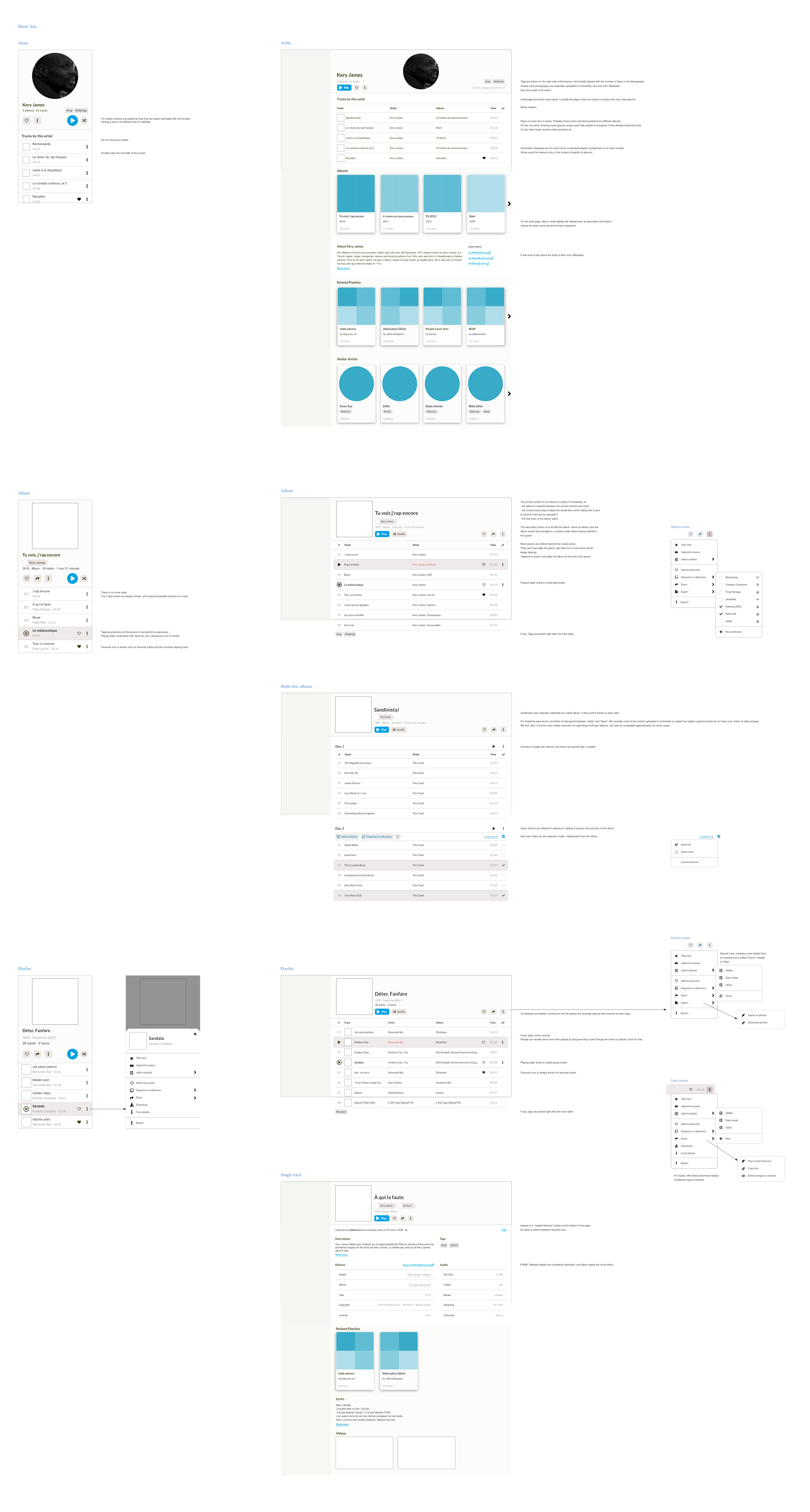
Design in progress
For music, we have been working on some mockups below. Some highlights:
- use a play/pause icon only for the current track, to give a sense of progression in the list
- use separators for more visual balance
- use similar lists everywhere, but show only the fields relevant to context
- alternate backgrounds between light (cards) and pure white backgrounds (text, lists)
- rely on scrolling rather than tabs
- on mobile, adapt button placements and actions menus
The new lists would bring several benefits…
Much more powerful and easier playlists:
-
#429 Add multiple tracks at once to a playlist -
#836 Add option to be able to import / export playlists -
#900 clone playlists -
#1185 add album to playlist action -
#1259 Add tracks to playlist from search
Smoother ways to organize and share your library:
-
#984 Add ability to move tracks between libraries -
#1007 bulk edit and move tracks -
#1283 Public share via link of a private track/album
Long time requested features:
-
#492 like on artists and albums -
#523 improve artist page and artist description -
#863 (closed) rely on MusicBrainz for Wikipedia links -
#1229 artist image -
#1230 feature the artist bio on the artist page -
#1231 Similar Artist Radio
Pending questions:
- what do we want to do with the albums layout?