Streamline UI for my profile / my content
What is the problem you are facing?
I have the feeling that the in current UI finding my content (and adding new one) is more difficult than it needs to. Instead of being scattered across different places, everything could be found in a single screen, under the user's profile. Here's a mock-up:
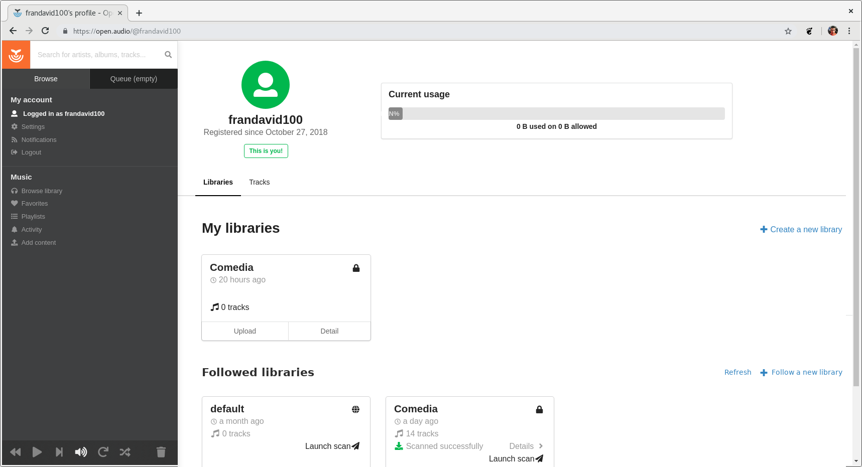
In the mockup, my profile shows my basic user information and how much of my quota I have used, but it also shows all my libraries and all the libraries I follow. And it also gives me the option to easily create a new library, or to follow a remote one.
What are the possible drawbacks or issues with the requested changes?
From my point of view this makes everything easier to find and doesn't make anything more confusing, so I don't see any drawbacks.